Choosing your wedding color palette is one of the first creative decisions you’ll make—and one of the most lasting. It sets the tone for everything from your floral arrangements to the dinner menu presentation. But beyond just the look, your palette shapes how your celebration feels to everyone involved.
Color speaks its own language. Soft neutrals can feel warm and inviting. Deep jewel tones bring richness and intimacy. A monochromatic palette can signal modern elegance. Whether you’re planning a coastal escape or a city celebration, the right wedding color palette creates visual harmony and emotional resonance across every touchpoint.
In this guide, we’ll walk you through the wedding color palettes that never go out of style—and introduce a few fresh favorites we’re seeing in today’s most elevated events. From sophisticated classics to unexpected pairings that still feel timeless, you’ll find plenty of inspiration here to begin shaping your own celebration.
For more on our signature planning approach and how we support couples through every detail, learn more about our team and philosophy here.
What Makes a Wedding Color Palette “Timeless”?
Some color pairings stand the test of time—and for good reason. A timeless wedding color palette blends balance, elegance, and versatility, making it easy to adapt across different venues, seasons, and cultural influences. Think soft ivory with blush, navy with crisp white, or muted sage paired with gold. These combinations don’t chase trends—they create a sense of harmony that feels considered and complete.
What makes these palettes truly timeless is their flexibility. They work whether your ceremony is on a California vineyard or a New York ballroom. And they transcend theme, allowing you to layer in personal elements without compromising the overall cohesion of your design.
At Emily Coyne Events, our full-service wedding planning team works closely with couples to refine their color choices—looking beyond Pinterest boards and toward palettes that feel both personal and elevated. Whether you’re planning with our team here in San Jose or envisioning something bold in Los Angeles, a seasoned planner’s eye can help you avoid overused combinations and build something with staying power.
Timeless doesn’t mean boring—it means intentional, tailored, and utterly enduring.

Timeless Color Palettes That Always Work
These combinations have stood the test of time—not just for their visual appeal but for how seamlessly they adapt to location, season, and style. Whether you’re planning a formal city affair or a breezy coastal weekend, these palettes offer a sophisticated foundation for your wedding design.
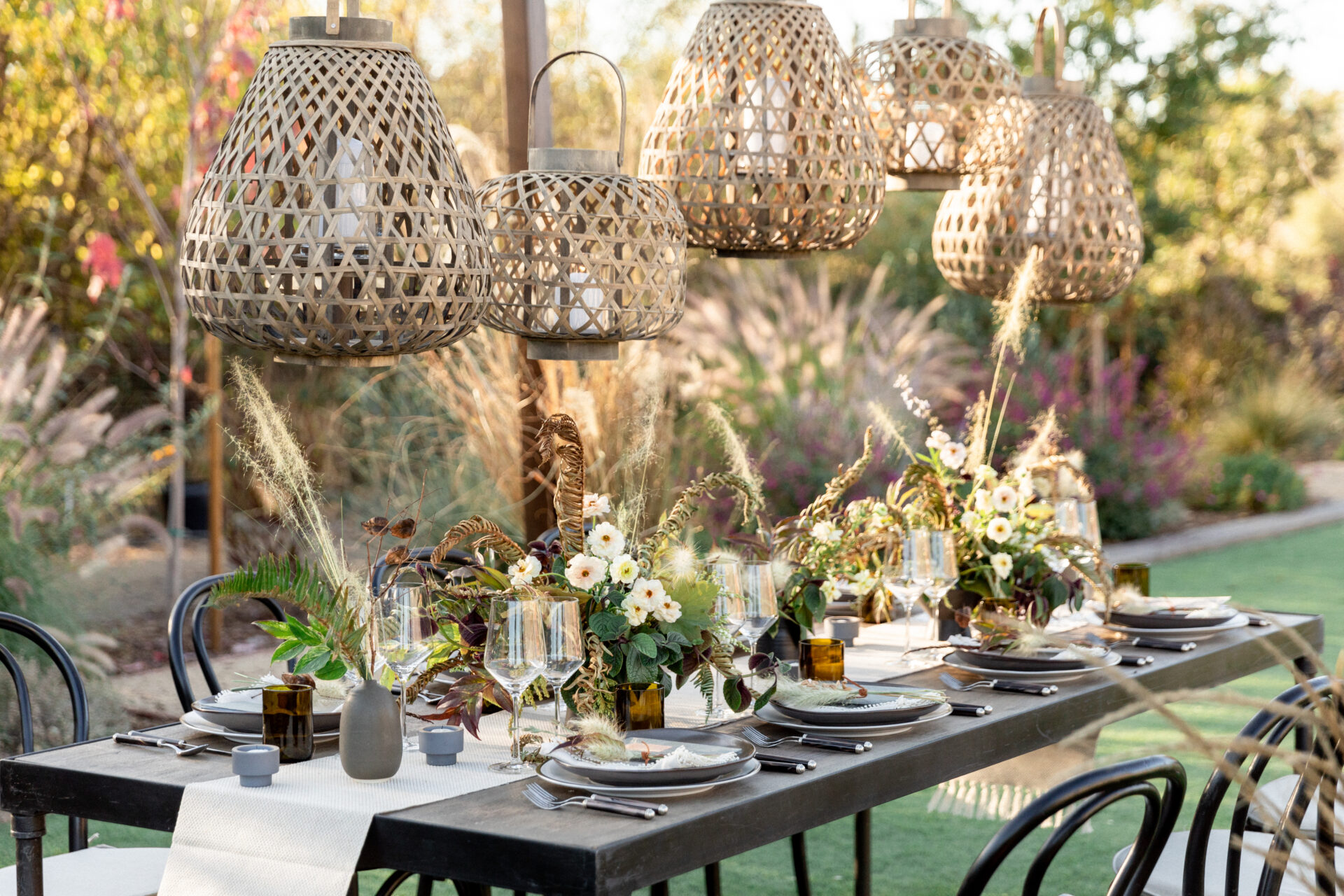
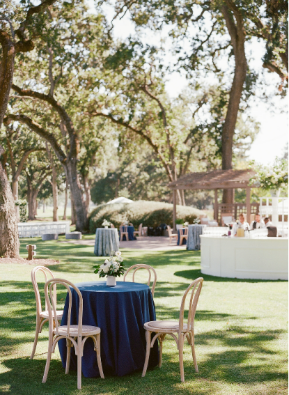
I. Ivory + Sage + Dusty Rose
Soft, grounded, and endlessly elegant, this palette combines muted tones that feel both fresh and classic. Ivory sets a warm base, sage brings in a calming natural element, and dusty rose softens the edges with a hint of romantic charm.
Best for: Outdoor weddings in wine country, European-inspired venues, and spring or early fall celebrations.
Pair with: Neutral linens, brushed gold flatware, and florals like ranunculus, garden roses, and eucalyptus. Wood and rattan textures layer beautifully.
Emily Coyne Events often turns to this timeless trio when couples want a soft yet layered aesthetic. Explore how we’ve brought this color story to life in our portfolio.
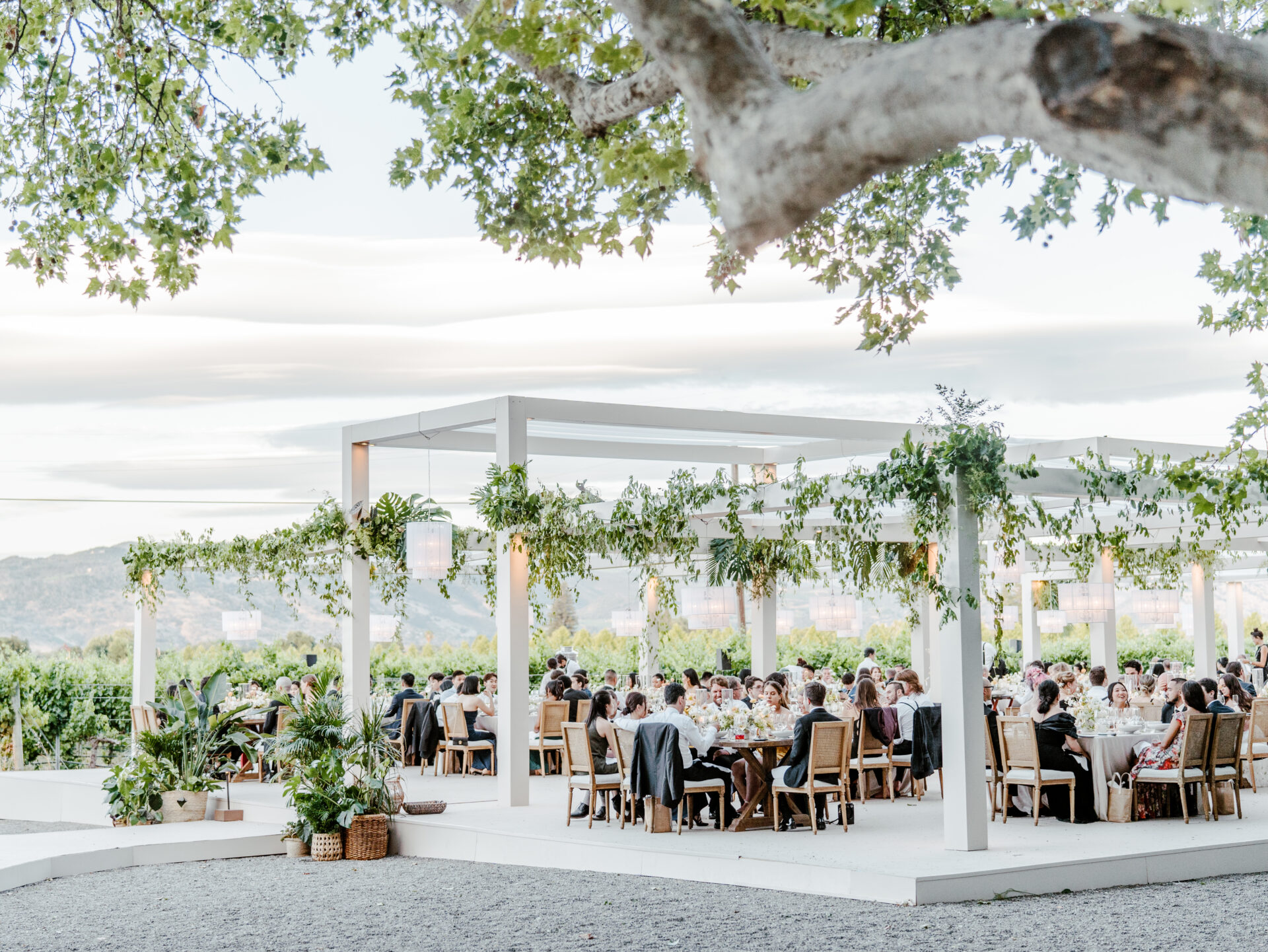
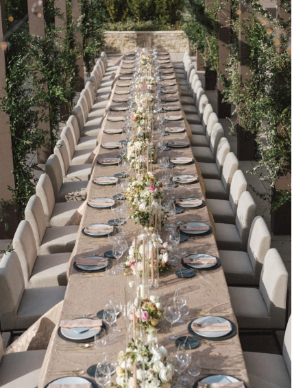
II. Navy + Champagne + White
A true classic, this combination balances bold and neutral with effortless grace. Navy grounds the look with depth, champagne adds a warm shimmer, and white brings in crisp refinement.
Best for: Evening weddings, urban rooftop venues, or black-tie coastal celebrations.
Pair with: Structured floral arrangements, modern stationery, and velvet or satin textures. White peonies, champagne roses, and calla lilies work especially well.
Couples looking for a clean, elevated palette often turn to this blend. Our team has used it to stunning effect in both East and West Coast weddings.
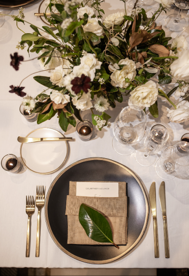
III. Emerald + Gold + Cream
Rich and refined, this color trio blends jewel-tone drama with soft neutrals. Emerald adds sophistication, gold offers radiant highlights, and cream keeps the palette feeling light.
Best for: Grand ballrooms, winter celebrations, or luxe fall weddings with a formal edge.
Pair with: Taper candles, gilded chargers, and florals like anemones, orchids, and deep greenery. Velvet lounges or marble details elevate the vibe even further.
This is one of our go-to combinations when couples want their wedding design to feel bold yet timeless.
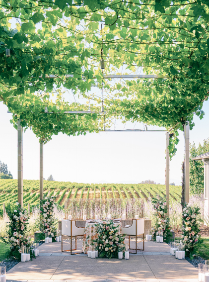
IV. Blush + Gray + Greenery
This palette has quiet strength. Blush adds warmth, gray provides cool balance, and greenery connects the entire look to the natural world. Together, they form a fresh but unfussy base for design.
Best for: Garden weddings, romantic elopements, or airy summer venues.
Pair with: Loose floral arrangements, gray taper candles, and soft textures like chiffon or silk. Think blush ranunculus, silver dollar eucalyptus, and airy baby’s breath.
Emily Coyne Events often recommends this trio for couples seeking a light, organic feel with long-term appeal.
V. Black + White + Minimalist Green Accents
This ultra-modern palette is all about contrast and clarity. Black and white bring high impact, while green accents keep things rooted and natural. It’s sleek without being sterile.
Best for: Contemporary city weddings, gallery venues, and formal indoor events.
Pair with: Tall calla lilies, structured arrangements, and modern décor like acrylic signage or black flatware. Add green via simple foliage or architectural greenery.
This look makes a statement without relying on color—perfect for design-forward couples who want drama with restraint.
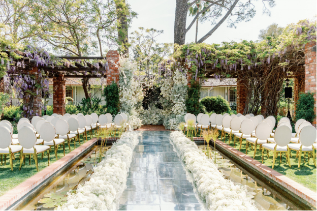
VI. French Blue + Dove Gray + White Florals
Soft and serene, this palette evokes European elegance. French blue provides a distinctive touch, dove gray grounds the look, and white florals bring everything to life.
Best for: Destination weddings in historic villas, French-style estates, or late spring events.
Pair with: White hydrangeas, delphiniums, and dusty miller. French linens, toile patterns, and calligraphy menus complete the vision.
Browse our portfolio to see how we’ve adapted this color story across both coastal and countryside settings.
Wedding Color Trends We’re Loving Now
This year’s color trends are anything but ordinary. Couples are embracing hues that tell a story—palettes that reflect personality, destination, and mood. These trending combinations are elevated yet approachable, from grounded neutrals to sun-soaked warmth.
I. Terracotta + Peach + Muted Coral
Warm, earthy, and inviting—this trio radiates a laid-back, sun-drenched glow. Terracotta adds grounding richness, peach softens the mood, and muted coral brings playful depth.
Ideal for: Riviera Maya weddings, tropical celebrations, or outdoor receptions in Puerto Vallarta. These tones look especially vibrant in natural light and golden-hour photos.
Planner tip: This palette pairs beautifully with textured linens, hand-thrown ceramics, and local blooms like marigolds or bougainvillea.
Many destination couples seeking a Riviera Maya or Puerto Vallarta wedding planner love this palette because it can feel festive without overpowering the scenery.
VII. Plum + Mauve + Antique Gold
Romantic with a moody edge, this combination is perfect for couples who want elegance with personality. Plum adds richness, mauve brings softness, and antique gold ties it together with vintage flair.
Ideal for: Autumn weddings, evening events, and historic venues. This palette flatters candlelight and adds drama without being too dark.
Planner tip: Mix in textured velvets, brass candlesticks, and blooms like dahlias, hellebores, and roses for a lush, layered look.
It’s a favorite for planners curating editorial, fashion-forward wedding aesthetics.
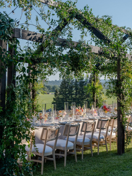
VIII. Olive + Linen + Terra Neutrals
Understated and organic, this grounded palette speaks to couples seeking natural sophistication. Olive evokes foliage, linen keeps things soft, and terra neutrals add warmth.
Ideal for: Outdoor ceremonies, vineyard venues, or eco-conscious events. It works beautifully year-round.
Planner tip: Combine with dried florals, woven chargers, and soft greenery like olive branches or seeded eucalyptus.
This palette is a go-to for full-service planners looking to create cohesion between the environment and event design.
IX. Soft Blue + Pale Yellow + Cream
Light and fresh, this pastel-inspired trio brings a sense of joy. Soft blue feels calming, pale yellow adds optimism, and cream ties everything together with elegance.
Ideal for: Garden weddings, spring brunch receptions, or coastal celebrations.
Planner tip: Use pale yellow sparingly for impact—perhaps in floral pops or napkin accents. Pair with hydrangeas, chamomile, and wildflowers.
It’s a gentle nod to nostalgia while feeling completely current.
X. Paprika + Rust + Sunset Hues
Fiery and bold, this palette channels the drama of golden hour. Paprika adds spice, rust brings depth, and sunset tones reflect the shifting sky.
Ideal for: Aspen, Park City, or desert weddings—especially in the fall or at dusk.
Planner tip: Pair with rich textures like velvet and raw silk. Add terracotta vessels, dried palms, and warm-toned lighting for a cohesive look.
Couples seeking an Aspen or Park City wedding planner love how this palette elevates mountain and desert settings with fiery elegance.
XI. Monochrome White + Mixed Textures
Minimal yet powerful, this trend strips away color and lets texture do the talking. Layers of white—matte, glossy, sheer, and soft—create depth without distraction.
Ideal for: Modern city venues, architectural spaces, and luxe indoor weddings.
Planner tip: Mix materials—think pleated linens, ceramic vessels, crisp calla lilies, and glossy orchids.
White-on-white has never looked so intentional. This trend is pure sophistication for couples who love minimalism but still want impact.
Tips for Choosing Your Wedding Color Palette
Choosing the perfect wedding color palette starts with one key question: how do you want your day to feel? Elegant and refined? Warm and festive? Timeless and minimal? Your answers should guide every choice from linens to florals.
Here are a few expert-backed tips to help you refine your palette:
- Start with your venue and season.
A beachside celebration in August calls for different tones than a winter ballroom wedding in New York. The natural lighting, architectural features, and landscape around you can all elevate—or clash with—certain hues. This is something an experienced NYC full-service wedding planning team will always consider. - Don’t forget the practical pieces.
Think about how your palette plays with wardrobe colors, floral flexibility, and even your guests’ overall experience. Deep jewel tones might be stunning in photos, but can feel heavy at a breezy summer garden ceremony. - Not every trend is the right fit.
It’s perfectly fine to skip a trend if it doesn’t feel like you. The best wedding color palettes reflect the couple—not the current Pinterest algorithm. - Let your planner guide the process.
Whether you’re working with an Atlanta luxury wedding planner or collaborating across coasts, a professional’s eye can help you balance personal style with the logistics of your day.
At Emily Coyne Events, we help couples define a palette that supports not just the look, but the feeling of the day—elegant, immersive, and entirely personal.
How Color Palettes Shape the Guest Experience
Your guests don’t just see your wedding color palette—they feel it. From the first invitation to the farewell brunch, your chosen hues set the emotional tone of the entire celebration.
- First impressions matter.
Invitations, welcome signage, and even your digital RSVP page offer the first glimpse into your wedding aesthetic. A well-curated palette helps guests feel the mood—whether that’s coastal elegance, formal black-tie, or tropical warmth. - Immersive design touches make it memorable.
Lighting, linens, floral choices, and attire all reinforce the theme in subtle, powerful ways. The best palettes weave through the entire experience—from the tablescape to the cocktail lounge—without feeling forced. That’s why working with a seasoned full-service wedding planning team can make such a difference in design cohesion. - It extends far beyond the ceremony.
Whether you’re planning a three-day destination celebration with a Caribbean wedding planner or an intimate dinner reception stateside, color helps guide your guests emotionally through each chapter—from welcome party to send-off brunch.
Let’s Design a Wedding That Feels Like You
Ultimately, the right palette doesn’t just look beautiful—it makes your guests feel completely immersed, welcome, and inspired at every turn.
Choosing the right wedding color palette isn’t just about aesthetics—it sets the foundation for every design decision that follows. From mood-setting invitations to cohesive décor details, your palette shapes the entire experience.
The good news? You don’t have to figure it all out alone. Whether you’re partnering with a certified event planner or working with luxury wedding planners, expert guidance ensures every element—color, texture, lighting—feels intentional and aligned with your vision.
At Emily Coyne Events, we don’t just choose colors—we design experiences that reflect your story. If you’re ready to start planning, contact Emily Coyne Events and let’s build something beautiful together.