Winter weddings present a distinct opportunity to approach color with intention and clarity. While colder months naturally bring muted landscapes and shorter daylight hours, carefully selected winter wedding colors can introduce warmth, depth, and visual energy without relying on seasonal clichés or decorative excess.
Color selection during winter is not about contrast for the sake of drama. It is about balance—between natural light, interior settings, textures, and the overall guest experience. When handled thoughtfully, winter palettes can feel grounded, modern, and elevated, supporting a cohesive design that feels intentional rather than decorative.
This guide explores practical color inspiration, pairing strategies, floral considerations, and décor planning approaches that help winter weddings feel inviting and visually engaging. It also reflects how experienced wedding planners and consultants for weddings in Minneapolis and destination-focused planning teams approach winter color strategy with precision.
Why Winter Wedding Colors Require a Different Design Approach
Winter weddings present a unique visual environment that calls for a more deliberate and strategic approach to color selection. Unlike spring or summer celebrations, winter light behaves differently. Days are shorter, sunlight is often softer or more directional, and many events rely heavily on interior lighting rather than natural daylight. As a result, colors must be chosen with an understanding of how they will appear under artificial light, candlelight, and evening settings.
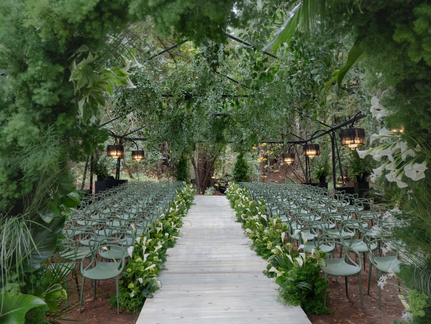
Natural greenery is also more limited during the winter months, which changes how color palettes function within the overall design. Without abundant foliage or outdoor florals to provide contrast, colors play a larger role in establishing depth and visual balance. This is why winter palettes often work best when they move beyond a single dominant hue. Layered tones, muted variations of the same color family, and carefully chosen neutrals help prevent designs from feeling flat or overly stark.
Texture becomes just as important as color in winter wedding design. Fabrics, finishes, and materials—such as matte linens, metallic accents, glass, or stone—interact with color to create dimension. When thoughtfully planned, these elements support a cohesive look across décor, florals, stationery, and styling details without overwhelming the space.
A structured color plan also supports stronger photography results. Winter lighting can amplify contrasts, so palettes that balance richness with restraint tend to photograph more consistently throughout the day and evening. For this reason, professional planning teams—whether a wedding planning service that serves NYC like Emily Coyne Events or a wedding consultant serving Nashville—often prioritize color decisions early in the planning process. Establishing a clear palette from the start helps align all creative partners and ensures a polished, cohesive result well-suited to the winter season.
Foundational Winter Wedding Color Palettes That Feel Current
Winter wedding colors tend to perform best when grounded in depth and restraint. Below are palette directions that consistently work well in winter environments while allowing flexibility across venues and destinations.
Deep Neutrals With Warm Undertones
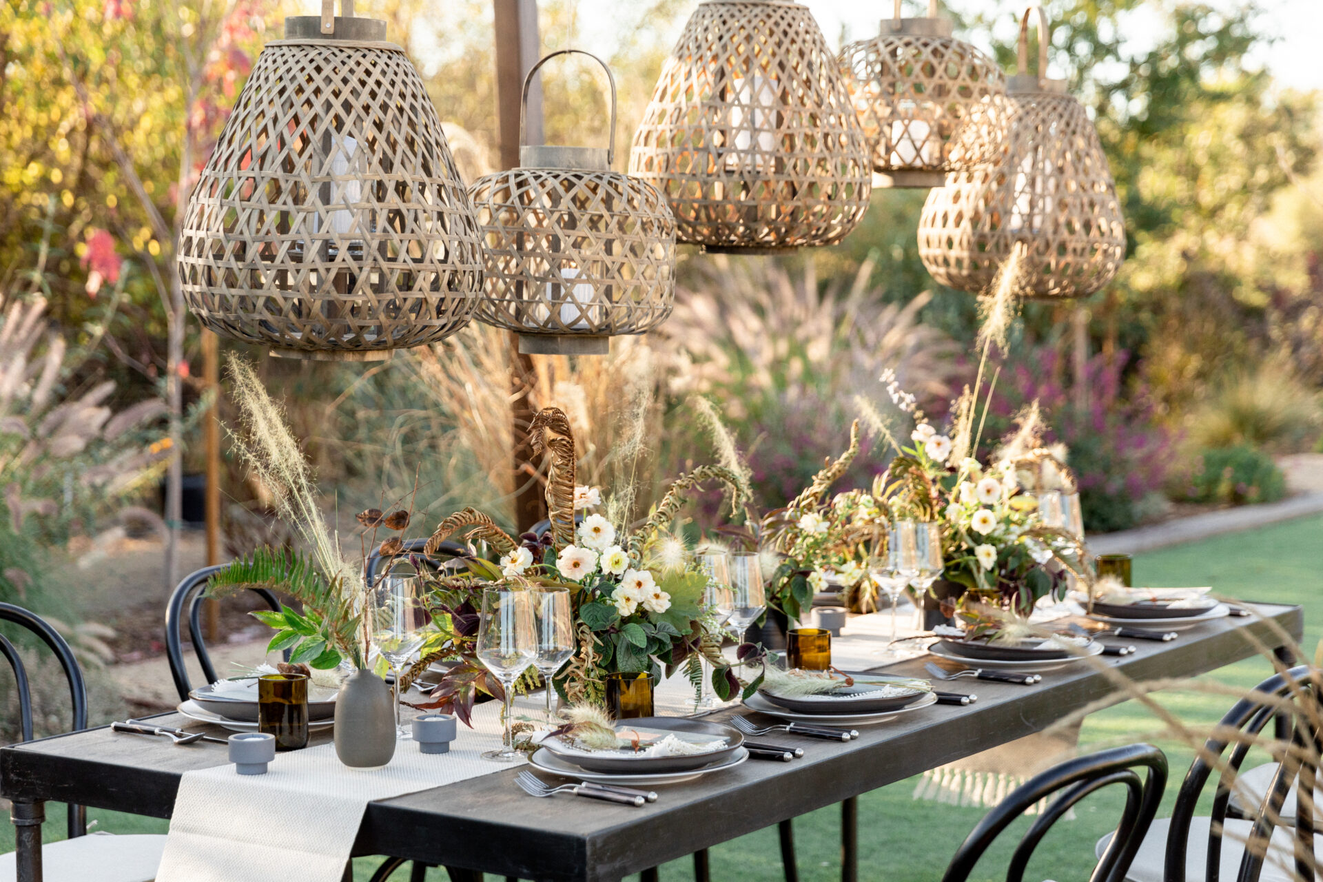
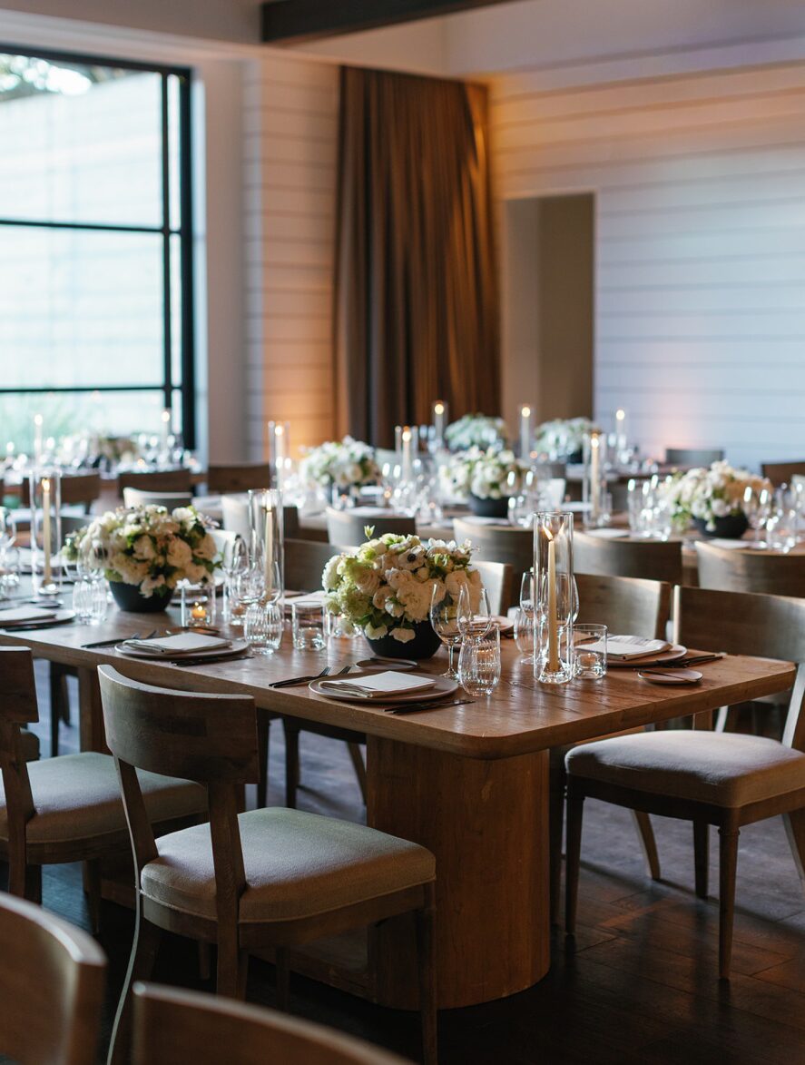
Charcoal, soft black, mushroom, and warm taupe create a strong foundation without overpowering the space. These tones pair well with winter light and provide a stable backdrop for accent colors.
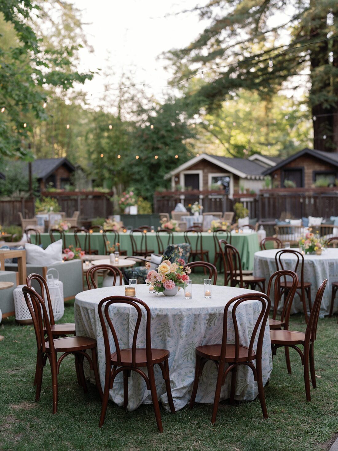
When used across linens, lounge furnishings, or structural décor, deep neutrals help anchor the overall visual plan and prevent brighter accents from feeling disconnected.
Muted Jewel Tones
Burgundy, forest green, navy, aubergine, and deep teal introduce color while maintaining composure. These shades photograph well indoors and complement winter florals without appearing seasonal in an obvious way.
Muted jewel tones can be layered across floral arrangements, textiles, and tabletop details to create cohesion without visual clutter.
Soft Metallic Accents
Brushed gold, antique brass, and pewter work best when used sparingly. These finishes reflect light subtly and add dimension without becoming focal points.
Metallics should be treated as supporting elements—appearing in candleholders, flatware, or structural décor—rather than dominating the palette.
How to Pair Winter Wedding Colors With Intention
Successful winter color pairing is less about boldness and more about proportion. Too many saturated tones can overwhelm a space, while overly restrained palettes may feel flat or disconnected. Thoughtful balance allows winter wedding colors to feel cohesive, dimensional, and visually engaging without competing for attention.
Rather than selecting colors in isolation, consider how each shade will appear across the full environment—linens, florals, attire, stationery, and architectural elements all contribute to the final look. When colors are assigned clear roles, the overall design feels purposeful rather than crowded.
Use the 60–30–10 Approach
One of the most reliable methods for pairing winter wedding colors is the 60–30–10 guideline. This structure creates consistency while leaving room for variation:
- 60% base neutrals,such as linens, visible flooring, walls, or large décor pieces, help ground the design and provide visual calm.
- 30% secondary tones appear in florals, upholstery, draping, and key décor elements, adding depth without overpowering the space.
- 10% accent colors are reserved for tabletop details, stationery, signage, or selective floral highlights, offering contrast and focus.
This approach keeps the palette unified while preventing any single color from dominating the room.
Consider Lighting Conditions Early
Winter weddings often rely heavily on interior lighting, which significantly affects how colors are perceived. Candlelight, overhead fixtures, and architectural lighting all interact differently with fabric, florals, and finishes.
Darker hues tend to absorb light, while lighter or reflective accents help maintain clarity and definition. Testing fabric swatches, paper samples, and floral tones under actual venue lighting can prevent unexpected shifts once the space is fully styled.
Early evaluation ensures winter wedding colors remain consistent from planning to execution, even as lighting changes throughout the event.
Floral Color Strategies for Winter Weddings
Florals play a central role in reinforcing winter wedding colors, particularly when outdoor greenery is limited. Rather than relying on volume, winter floral design benefits from structure, contrast, and tonal variation.
Seasonal Florals That Support Winter Palettes
Winter-friendly floral options include:
- Hellebores
- Ranunculus
- Anemones
- Tulips
- Garden roses
- Amaryllis
These blooms hold color well and pair seamlessly with deeper palettes.
Using Foliage and Texture Thoughtfully
Foliage such as smilax, olive branches, eucalyptus, and camellia leaves can introduce movement and softness without overwhelming arrangements.
Texture—rather than color saturation—often becomes the defining factor in winter floral design. Layering matte and glossy finishes adds visual interest while maintaining restraint.
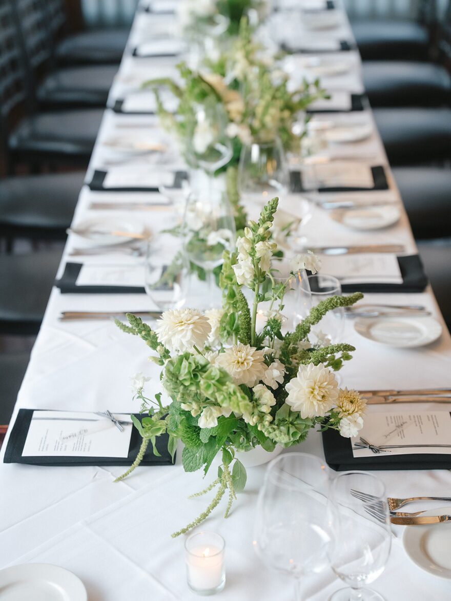
Controlled Use of White and Ivory
White florals remain relevant in winter but should be balanced with depth elsewhere in the palette. All-white arrangements can feel stark in winter settings unless supported by warm neutrals or subtle tonal contrast.
Décor Elements That Enhance Winter Wedding Colors
Décor decisions should reinforce color choices rather than compete with them. Winter weddings often rely on interior architecture, furnishings, and layout more heavily than outdoor seasons.
Tabletop Styling With Purpose
Linens, chargers, and tableware should reflect the base palette rather than introduce new colors. Subtle variation in texture—such as linen blends or stoneware—adds dimension without visual noise.
Save the dates and printed materials should echo the established color palette to maintain consistency from pre-event communication through the wedding day itself.
Furniture and Structural Décor
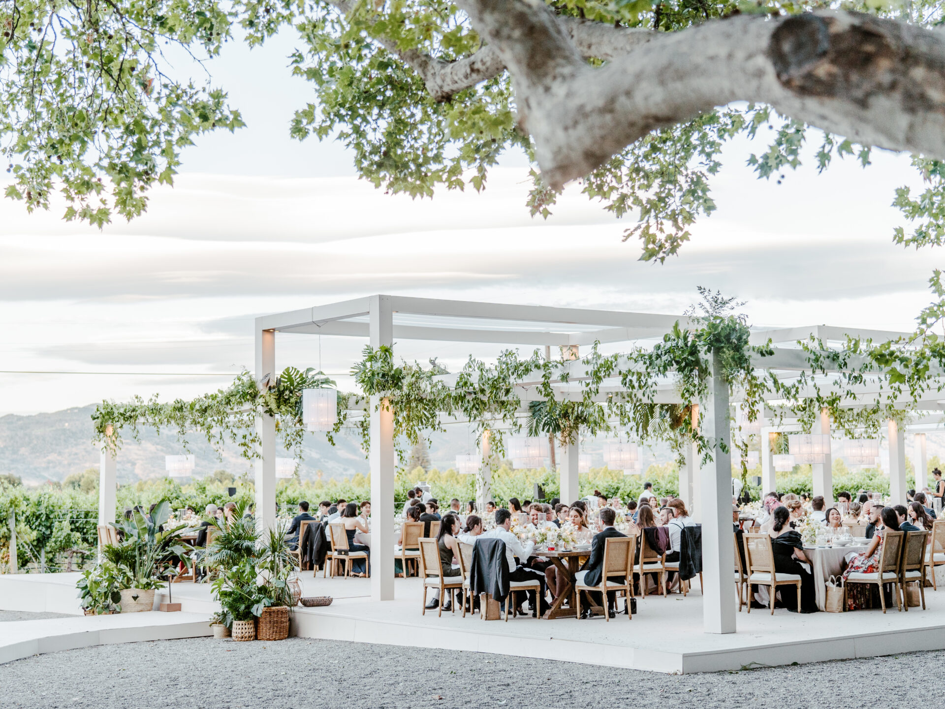
Furniture selections should align with the overall color direction. Neutral upholstery allows florals and tabletop elements to stand out, while darker wood tones add warmth in winter environments.
Structural décor, including ceremony backdrops or entry installations, should prioritize clean lines and restrained color use to avoid overwhelming the space.
Destination Considerations for Winter Wedding Colors
Winter does not look the same everywhere. Color planning must account for location-specific factors, especially for destination events.
Cold-Climate Cities
In locations such as Minneapolis, winter wedding colors often lean warmer to offset exterior conditions. Rich neutrals, deep greens, and layered textures help counterbalance snow-covered surroundings.
Experienced wedding planners and consultants for weddings in Minneapolis often design palettes that feel grounded indoors while remaining visually strong in photography.
Urban Winter Weddings
For city venues in places like New York, winter palettes often reflect architectural surroundings. Clean neutrals paired with controlled accent colors complement industrial or historic spaces without feeling heavy.
A wedding planning service that serves NYC, like Emily Coyne Events, frequently integrates venue materials—stone, metal, wood—into the color strategy to maintain cohesion.
Warm-Climate Destinations in Winter
For destination events in locations such as Los Cabos, winter wedding colors can shift lighter while still maintaining depth. Sand tones, soft terracotta, and muted blues align with the environment without referencing seasonal trends.
Full-service wedding planning services that serve Los Cabos often focus on color palettes that bridge winter timing with warm-weather settings, ensuring the design feels intentional rather than mismatched.
Maintaining Color Consistency Across the Planning Process
Maintaining color consistency throughout the wedding planning process requires structured oversight and clear communication. Without a defined framework, even well-intentioned creative partners may interpret a color palette differently, resulting in subtle mismatches across florals, linens, stationery, and décor elements. Over time, these inconsistencies can create visual disconnects that weaken the overall design.
Full-service planners play a critical role in managing this complexity. Rather than treating color selection as a one-time decision, they guide its application across every stage of planning and production. This approach ensures that winter wedding colors are not only chosen thoughtfully but executed with precision.
Full-service planners typically provide:
- Defined color references and material samplesthat establish exact tones, finishes, and textures for vendors to follow
- Clear guidelines for floral and décor execution, including how colors should appear under different lighting conditions common to winter venues
- Ongoing review of design elements before production, allowing adjustments to be made before materials are finalized or installed
This level of involvement minimizes guesswork and keeps all creative partners aligned. Florists, rental companies, stationers, and lighting teams work from the same visual standards, reducing the risk of last-minute corrections or inconsistencies.
Color consistency is especially important for winter weddings, where deeper hues, metallic accents, and layered textures are often used together. A slight variation in shade or finish can stand out more prominently in seasonal lighting and neutral backdrops.
By maintaining oversight from initial planning through final installation, full-service planners ensure that winter wedding colors translate cohesively across every design element. The result is a polished, intentional visual experience that feels unified rather than pieced together—achieved through planning discipline rather than aesthetic guesswork.
Avoiding Common Winter Color Pitfalls
Even well-planned winter palettes can falter without careful attention.
Common challenges include:
- Overusing dark tones without contrast
- Introducing too many accent colors
- Ignoring how fabrics absorb light
- Selecting florals without considering seasonal availability
Addressing these factors early allows the palette to support the overall experience rather than distract from it.
The Role of Strategic Planning in Winter Color Design
Winter weddings benefit from early design decisions and disciplined execution. Color should never be an afterthought—it influences venue selection, floral planning, décor sourcing, lighting decisions, and overall visual continuity. When color planning begins early, every element of the event can work together cohesively rather than feeling pieced together late in the process.
In winter settings, especially, strategic color design helps counterbalance limited daylight, neutral landscapes, and indoor-heavy venues. Thoughtful palettes can enhance architectural details, complement seasonal textures, and guide decisions around linens, stationery, attire, and tablescapes. This approach also supports efficient sourcing, as winter-specific materials, florals, and rental items often require longer lead times.
Whether working with a wedding consultant serving Nashville or planning a destination celebration, experienced planners treat winter color design as a foundational planning tool rather than a purely decorative layer. Palette decisions inform which venues are most suitable, how lighting should be adjusted for warmth or contrast, and how floral selections can remain impactful despite seasonal availability.
Strategic planning also reduces last-minute changes and visual inconsistencies. When color direction is clearly defined early on, vendors can align their work to the same vision, resulting in a polished, intentional final presentation that feels balanced, cohesive, and seasonally appropriate.
Creating Visual Warmth Through Winter Wedding Colors
Winter wedding colors offer a unique opportunity to build depth, clarity, and visual cohesion when approached with intention. By prioritizing balance, texture, and proportion, couples can create an environment that feels considered and engaging without relying on seasonal tropes.
Thoughtful color planning allows winter weddings to feel welcoming, visually strong, and consistent across every touchpoint—supporting a polished experience from start to finish.
For couples seeking a carefully considered approach to winter wedding design, Emily Coyne Events provides comprehensive wedding planning services rooted in precision, discretion, and thoughtful execution.
Our team works closely with creative partners to ensure every design decision—color included—supports a cohesive and intentional celebration. Connect with us today.